Additional WIM Concept Designs 2
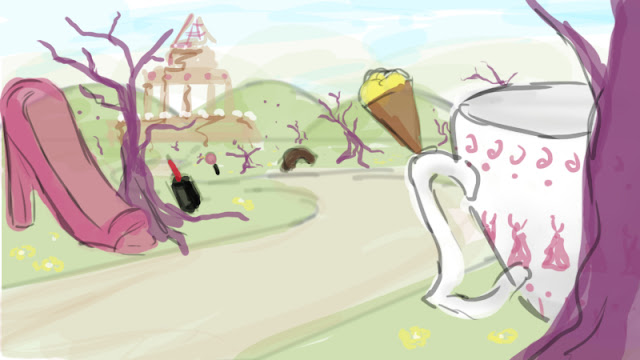
I created three more designs for my WIM city and I am way more happy with what these designs look like. To get rid of the empty space I used some of Stoller's trees and flower in these designs.
Nevertheless I still feel like it is not crowded enough and the hero building is still too visible.
Nevertheless I still feel like it is not crowded enough and the hero building is still too visible.
 |
| Design 4 |
 |
| Design 5 |
 |
| Design 6 |


5 is strongest... but maybe instead of 'trees'... why not street lights or similar? As in...
ReplyDeletehttp://www.owllights.net/article-188.html
This could change your 'time of day' / mood to something a bit less pastel - so dusk in the Stoller ruins? (Not all the street lamps could be working...)
(also decent trees are notoriously difficult to model successfully at this stage in your Maya life-span...)
The only other thing I'd say is all your big objects are looking very 'placed' as opposed to looking more like 'relics' (if that's still your plan?) If so, can I suggest that you look at skewing them a bit, so they are a) not standing completely perpendicular and b) that you sort of 'bury them' a bit in the ground plane, so they look as if time and the elements have had their way with them?